
Boutique Retail Store Design Ideas That Drive Sales
A boutique can carry excellent products, price them fairly, and still underperform, not because of the merchandise, but because of the room around it. Customers who can’t tell where to go, displays that are too crowded to read, an entrance that dumps them straight into a wall of product, lighting that flattens color, or a checkout counter that interrupts the flow all quietly work against a sale that should have happened. This article walks through practical retail store design ideas that address those exact friction points, how layout, lighting, displays, and checkout placement shape what a customer notices, how long they stay, and how comfortable they feel buying. The goal isn’t inspiration; it’s a set of decisions a boutique owner can actually apply, or bring to a designer, to make the store easier to shop and easier to love.
Karamia Designs, a Los Angeles interior design studio, approaches retail environments as both a business tool and a brand expression, which is the lens this article uses throughout.
What Makes a Boutique Retail Store Design Effective?
An effective boutique design makes it easy for customers to enter, orient themselves, discover products, interact with merchandise, and reach checkout without friction.
That sounds simple, but it depends on several systems working together: a layout that supports natural movement, lighting that makes products look accurate and appealing, displays that create clear visual priority, and a checkout sequence that feels like a natural conclusion rather than an obstacle. Good retail design is not decoration alone; it is behavioral and commercial strategy. Every material choice, sightline, and fixture placement either helps a customer move through their decision-making process or gets in the way of it. When a store “feels right,” it’s usually because someone thought carefully about how a person actually walks, looks, and decides, not just about what looks good in a photo.
12 Boutique Retail Store Design Ideas That Can Support Sales
Idea 1: Design the Entrance as a Strong First Impression
The idea: Treat the first several feet inside the door as a decompression zone, not a display zone.
Why it matters: Shoppers need a moment to shift from sidewalk pace to browsing pace. If the entrance is cluttered with signage, sale racks, or too many competing products, customers slow down before they’ve even adjusted, or they miss the transition entirely and walk past the merchandise that matters most.
How to implement it: Keep the immediate entry area visually calm, with one clear sightline to a strong focal display slightly further in. Storefront visibility should hint at the brand from outside without giving away the entire story.
Business impact: A well-paced entrance increases the likelihood a customer slows down and actually looks, rather than defaulting to a quick lap around the perimeter.
Idea 2: Create a Natural Customer Flow
The idea: Design circulation paths that feel intuitive rather than imposed.
Why it matters: Customers rarely read a store like a map. They follow sightlines, open space, and the products that catch their eye. Narrow aisles, dead-end alcoves, or awkward pinch points quietly push people back toward the door.
How to implement it: Keep primary aisles wide enough for comfortable two-person passing, angle key fixtures to guide the eye deeper into the store, and avoid forcing shoppers into a single rigid loop. A balance of guided movement and free browsing tends to outperform either extreme.
Business impact: Better flow means more square footage actually gets seen, which directly increases how many products a customer has the chance to consider.
Idea 3: Build a Clear Visual Hierarchy
The idea: Establish one primary focal point, secondary displays, supporting merchandise, and a distinct transaction zone, in that order of visual weight.
Why it matters: When everything in a store competes for attention at once, nothing wins. Shoppers default to scanning quickly and disengaging.
How to implement it: Place fewer, stronger visual anchors rather than distributing emphasis evenly across every fixture. A single feature table near the entrance carries more weight than five scattered displays of equal size.
Business impact: Clear hierarchy shortens the time it takes a customer to understand what the store is about, which supports faster, more confident browsing.
Idea 4: Use Lighting to Make Products Look Their Best
The idea: Layer ambient, accent, task, and display lighting rather than relying on one flat source.
Why it matters: Lighting shapes how color, texture, and detail actually read. Flat, overly cool, or harsh lighting can make well-made products look cheap; uneven lighting creates shadows that hide detail exactly where a customer is trying to evaluate quality.
How to implement it: Use ambient lighting for general comfort, accent lighting to draw the eye to key displays, and dedicated task lighting near mirrors and fitting rooms. Pay attention to color temperature consistency and avoid glare on glass or metal fixtures.
Business impact: Products that look accurate and flattering under store lighting build more purchase confidence than products that look different once a customer gets them home.
Idea 5: Use Displays to Encourage Product Discovery
The idea: Curate fewer products per display rather than filling every surface.
Why it matters: Overcrowded displays force customers to do the editing work themselves, and most won’t bother. A smaller, well-chosen grouping communicates “these matter” far more clearly than a wall of everything at once.
How to implement it: Instead of “use good displays,” place a small number of high-priority items on a feature table near a natural pause point, rotate seasonal groupings regularly, and use vertical merchandising and mannequins to break up flat shelving.
Business impact: Strategic curation increases the odds a customer notices and engages with the specific products a retailer most wants to sell.
Idea 6: Make the Checkout Area Part of the Design
The idea: Design checkout as an intentional final step in the journey, not a leftover corner.
Why it matters: A poorly placed or visually cluttered checkout can create a bottleneck, obstruct sightlines, or make the end of the shopping experience feel abrupt.
How to implement it: Position checkout where staff can see the sales floor, keep the counter visually tidy, add small impulse merchandise within easy reach, and make sure staff have enough space to work without blocking customer sightlines.
Business impact: A smooth, visible checkout reduces perceived wait time and supports small additional purchases without disrupting the overall brand feel.
Idea 7: Use Color to Reinforce the Brand
The idea: Choose a color strategy, often a neutral background with a deliberate accent, that supports the merchandise rather than competing with it.
Why it matters: Color shapes emotional tone and perception of brand consistency, but a busy or mismatched palette can make products harder to see clearly against the backdrop.
How to implement it: Use neutral wall and fixture tones as a canvas, reserve saturated brand color for accent walls, signage, or fixtures, and keep the palette consistent across finishes so the space feels considered rather than assembled piecemeal.
Business impact: Consistent color use strengthens brand recognition and keeps visual attention on the product, not the background.
Idea 8: Add Comfortable and Strategic Fitting Areas
The idea: Treat fitting rooms as a design priority, not an afterthought.
Why it matters: For fashion boutiques, the fitting room is often where a purchase decision is actually made. Poor lighting, cramped space, or a lack of privacy can undo the confidence a customer built while browsing.
How to implement it: Prioritize flattering, accurate lighting, quality mirrors, adequate hooks and surfaces, comfortable companion seating nearby, and clear circulation so fitting rooms don’t feel hidden or awkward to reach.
Business impact: A fitting room that makes customers feel good in front of the mirror supports the confidence needed to complete a purchase.
Idea 9: Design for Small Boutique Spaces
The idea: Solve for limited square footage with smarter fixtures, not lower design ambition.
Why it matters: A small store doesn’t need to look inexpensive, it needs every element working harder.
How to implement it: Use vertical storage and wall-mounted displays to free up floor space, choose multifunctional fixtures, keep sightlines open with mirrors and lighter materials where appropriate, and control product density so the space reads as curated rather than cramped.
Business impact: Thoughtful small-space design lets a boutique feel premium and legible even in a compact footprint.
Idea 10: Create an Experiential Retail Moment
The idea: Give the store at least one memorable, sensory, or story-driven moment that can’t be replicated by scrolling a website.
Why it matters: NRF’s discussion of experiential retail highlights how physical stores continue to offer brand connection, storytelling, and memorable experiences that digital shopping can’t fully replicate. A boutique that leans into tactile materials, a distinctive installation, or a photo-worthy corner gives customers a reason to remember, and talk about, the visit.
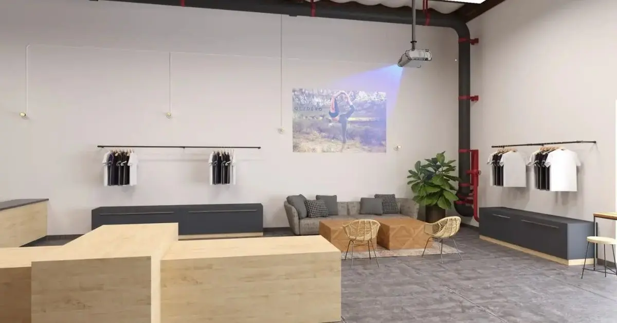
How to implement it: Choose one focal moment rather than scattering “experience” thin across the whole floor: a textured material feature, a branded installation, or a vignette that reflects local identity. Karamia Designs’ commercial design portfolio includes retail projects, such as the Glyder Yoga Clothing Store and The Souvenir Store, built around this kind of distinct in-store identity.
Business impact: A memorable moment supports repeat visits and word-of-mouth in a way that pure product display alone doesn’t.
Idea 11: Connect Physical Design With Digital Retail
The idea: Let the physical store acknowledge and support how customers already shop online.
Why it matters: NRF research points to shoppers increasingly moving between physical and digital channels, which makes connected touchpoints more relevant even for small boutiques.
How to implement it: Where useful, incorporate QR codes linking to extended product information, visible signage for buy-online-pickup-in-store, social-media-friendly display corners, and simple loyalty program visibility at checkout. Keep this supporting, not central, this remains a physical design article first.
Business impact: Small digital touchpoints can extend engagement beyond the visit without requiring a full technology overhaul.
Idea 12: Design for the Entire Customer Journey
The idea: Treat the full sequence, street, entrance, orientation, discovery, product interaction, fitting or consideration, checkout, exit, as one continuous, intentional experience rather than a set of disconnected zones.
Why it matters: Retail design mistakes often happen at the seams between zones: a strong entrance that dumps into confusing circulation, or great displays that lead to an awkward checkout. The journey should feel like one coherent story, not a series of separately designed rooms.
How to implement it: Map the path a typical customer takes from the sidewalk to the door and walk it. Note every point where attention might drop or confusion might creep in, then design each transition, not just each zone, deliberately.
Business impact: A cohesive journey compounds the value of every individual design decision, which is often what separates a store that “looks nice” from one that actually performs. This is where working with a team focused on commercial interior design services tends to pay off, since coordinating the full sequence requires balancing layout, lighting, materials, and brand identity at once.
How Store Layout Influences Customer Behavior
Layout shapes behavior through a simple sequence: See → Explore → Interact → Consider → Purchase.
Sightlines determine what a customer notices first. Circulation determines how far they’re willing to go. Pause points, a feature table, a mirror, a seating nook, give shoppers a natural reason to stop rather than keep moving toward the exit. Transition zones, like the space between the entrance and the main floor, need to feel smooth rather than abrupt, or customers rush past merchandise that deserved a second look. Bottlenecks, whether from narrow aisles or a poorly placed fixture, quietly discourage exploration even when no one consciously notices why. And checkout visibility matters throughout the visit, not just at the end, customers are more comfortable browsing when they can sense where the transaction point is without it dominating the space.
None of this requires trend-chasing. It requires understanding how people actually move through a room. For boutiques weighing broader design direction, it’s worth reviewing current commercial design trends, but layout fundamentals like these hold steady regardless of which finishes are in style.
Boutique Retail Store Layout Ideas by Store Type
Different boutique categories carry different design priorities. The table below outlines general starting points, actual strategy should still be shaped around the specific brand and space.
| Boutique Type | Design Priority | Recommended Design Approach |
|---|---|---|
| Fashion Boutique | Product discovery + fitting | Flexible displays + well-designed fitting zones |
| Jewelry Boutique | Security + premium presentation | Controlled displays + focused, precise lighting |
| Beauty Boutique | Sampling + product education | Accessible displays + generous mirror placement |
| Home/Lifestyle Boutique | Browsing + storytelling | Room-like vignettes over flat shelving |
| Gift Boutique | Discovery + impulse purchase | Layered displays + flexible, easily refreshed shelving |
| Luxury Boutique | Exclusivity + brand perception | Lower product density + premium materials |
How to Design a Small Boutique Without Making It Feel Cramped
The real question most small-space owners are asking is: how do I make the store feel bigger without sacrificing merchandise?
A few strategies tend to matter most: vertical merchandising to free up floor area, clear and uninterrupted circulation paths even if they’re narrower than ideal, fewer but visually stronger displays instead of maximum product density, well-placed mirrors to extend perceived depth, transparent or visually light fixtures that don’t block sightlines, multifunctional furniture that serves storage and display at once, wall-mounted storage to keep the floor open, and a controlled, cohesive color palette that keeps the eye moving smoothly rather than catching on visual noise. None of this requires a smaller inventory, it requires a more disciplined presentation of it.
Retail Lighting Ideas That Improve Product Presentation
Good retail lighting should help customers see products accurately, navigate comfortably, and notice priority merchandise, without overpromising a specific fixture or wattage as a universal fix.
- Ambient lighting sets the overall comfort level of the space.
- Accent lighting draws attention to key displays and focal points.
- Display lighting ensures individual products read with accurate color and detail.
- Fitting-room lighting should be flattering and consistent with how the product will look in daylight.
- Checkout/task lighting supports staff accuracy without creating glare for customers.
The right combination depends on ceiling height, storefront exposure, and merchandise type, which is why lighting decisions are usually made alongside layout and materials rather than in isolation.
How to Use Materials and Finishes to Strengthen Brand Identity
Flooring, millwork, metal finishes, wood, stone, glass, textiles, and wall finishes all contribute to how “considered” a store feels. Consistency across these choices, rather than variety for its own sake, is what creates a recognizable environment customers associate with the brand. Sustainable materials can also reinforce brand values when relevant to the retailer’s positioning. Material choice supports a premium perception, but it works in combination with layout and merchandising, not as a substitute for them.
Common Boutique Store Design Mistakes That Can Hurt the Shopping Experience
- Overcrowding displays until nothing stands out
- Poor circulation that creates bottlenecks or dead ends
- Inconsistent branding across fixtures, signage, and finishes
- Insufficient or mismatched lighting
- Weak storefront presentation that fails to signal what’s inside
- Confusing or absent wayfinding signage
- A checkout placed where it interrupts flow or blocks sightlines
- Ignoring staff workflow when planning fixtures
- Designing only for photographs rather than for actual shoppers
- Forgetting accessibility for aisles, fitting rooms, and checkout
- Overlooking long-term maintenance of materials and finishes
- Adopting trends without checking they fit the brand
A common mistake we see is treating these as separate problems, when in practice most of them trace back to the same root cause: designing zones individually instead of designing the full customer journey.
How to Measure Whether Your Retail Design Is Working
Design changes should be evaluated with both qualitative and quantitative signals, tracked over time rather than judged from a single visit:
- Foot traffic
- Conversion rate
- Dwell time
- Average transaction value
- Units per transaction
- Repeat visit rate
- Fitting-room usage
- Product engagement
- Queue time
- Direct customer feedback
It’s worth being careful here: design changes rarely happen in isolation. Merchandising updates, pricing shifts, promotions, staffing changes, and seasonality can all move these numbers at the same time as a redesign. The better approach is to track metrics consistently before and after a change and treat design as one input among several, not the sole explanation for a shift in performance.
When Should You Hire a Retail Interior Designer?
Professional design support tends to make the most sense when a retailer is:
- Opening a new boutique from scratch
- Planning a major renovation
- Repositioning or refreshing a brand identity
- Expanding into a larger or different location
- Struggling with customer flow or circulation issues
- Underusing an awkward or limited floor plan
- Pursuing a luxury or premium market position
- Coordinating complex lighting, millwork, or custom fixtures
- Integrating brand identity across every material and finish
- Managing multiple interdependent design decisions at once
From a space-planning perspective, this is usually where an outside eye adds the most value, not because a business owner lacks taste, but because coordinating flow, lighting, materials, and brand across an entire space is a full discipline of its own. If you’re planning a boutique in Los Angeles and need help translating your brand into a functional retail environment, Los Angeles commercial interior design support can help develop the spatial strategy, materials, lighting, and layout as one cohesive approach.
Karamia Designs approaches commercial interiors through spatial strategy, customer flow, brand identity, material selection, lighting, and functional layout, balancing strategy and beauty with an eye toward customer flow, product visibility, brand atmosphere, and conversion, particularly for boutiques navigating Los Angeles’s compact urban spaces, diverse neighborhood identities, and premium retail expectations.
The goal isn’t simply a beautiful store, it’s a store designed so the environment itself supports how customers actually browse, decide, and buy.
If you’re weighing a new location, a remodel, or a brand repositioning, commercial interior design in Los Angeles is a conversation worth having early, while layout and brand strategy can still shape every other decision that follows.
FAQ
What makes a boutique retail store design effective?
An effective design makes it easy for customers to enter, orient themselves, discover products, interact with merchandise, and reach checkout without friction, combining layout, lighting, displays, and brand identity into one coherent experience.
How should a small boutique be laid out?
Prioritize clear circulation, vertical merchandising, fewer but stronger displays, and open sightlines. Controlled product density and consistent color use help a small space feel curated rather than cramped.
How can store design influence sales?
Design shapes customer behavior, where they look, how long they browse, and how confident they feel evaluating a product, which affects the opportunity for a sale, even though design works alongside merchandising, pricing, and service rather than in isolation.
What lighting is best for a boutique?
A layered approach combining ambient, accent, display, and task lighting tends to work best, since each layer serves a different purpose, from overall comfort to highlighting priority merchandise.
How do I make a small retail store feel larger?
Use vertical storage, mirrors, lighter or transparent fixtures, controlled product density, and a cohesive color palette to keep sightlines open and reduce visual clutter.
Where should checkout be placed in a boutique?
Checkout should be visible to staff for oversight, positioned so it doesn’t block key sightlines or circulation, and designed to feel like a natural conclusion to the shopping journey rather than an obstacle.
How much product should be displayed in a boutique?
Less is often more effective. A smaller, well-curated selection on a feature display tends to communicate priority more clearly than filling every available surface.
What should I consider before remodeling a retail store?
Consider current customer flow issues, brand consistency across materials and finishes, lighting quality, checkout placement, and how the full customer journey, not just individual zones, currently performs.
When should I hire a retail interior designer?
Consider professional support for a new store opening, major renovation, brand repositioning, expansion, persistent flow problems, or when coordinating complex lighting, materials, and layout decisions at once.
How can retail design strengthen a brand?
Consistent color, materials, and finishes across the space, paired with a memorable experiential moment, help customers form a clear, repeatable impression of the brand beyond the products themselves.