

Butler’s 2026 Paint Colour Trends for Los Angeles Homes
Gray had a long run. Now the paint aisle is full of khaki, espresso brown, and muted green, and choosing among them takes more than a swatch. The 2026 paint color trends point toward warmth and depth, but how those colours look depends on the light, the flooring, and the room itself.
The most reliable palettes are planned around how a room is used and how much natural light it gets. If you are still shaping a repaint or renovation, early residential interior design planning lets you test colors against the layout, finishes, and lighting before anything is painted.
What Are the Main 2026 Paint Color Trends?
Warm neutrals such as khaki and soft beige lead, followed by earthy taupes, muted greens, and deep espresso browns. Cool grays are fading. In bright Los Angeles light, choose by undertone and test large samples before you commit.
| Trend | Where it works best | What to watch |
| Warm neutrals (khaki, soft beige) | Living areas, hallways, open plans | Mid-tones can read deeper than expected |
| Earthy tones (taupe, stone) | Bedrooms, dining rooms | Undertones can turn pink or green |
| Muted greens | Offices, powder rooms, accents | Lighter greens can look yellow in warm light |
| Rich browns | Built-ins, cabinets, dens | Need good lighting in smaller rooms |
Why Are Warm Neutral Paint Colors Leading?
Homeowners are choosing colors that feel lived-in rather than sterile. Sherwin-Williams named Universal Khaki (SW 6150) its 2026 Color of the Year, a warm, grounded neutral that sits between beige and taupe.
After more than 22 years of residential design in Los Angeles, one pattern repeats: this kind of khaki paint color is a mid-tone, so it reads deeper than most beiges. It works well on living-room walls or cabinetry, but it is worth sampling before using it throughout a whole house. If you want the warmth with less weight, the lighter neutrals in the same family are a good alternative.
What Makes Earthy Paint Colors a Top Choice?
Soft taupes, warm stones, and clay-inspired tones create calm after years of high-contrast interiors. They pair naturally with oak flooring, limestone, linen, and woven textures.
Bedrooms, dining rooms, and secondary living spaces are good places to use them. For a compact bedroom, these small bedroom design layout and storage tips show how color and layout can work together.
Are Green Paint Colors Still Trending?
Yes, and the direction is moving forward. For 2027, Benjamin Moore chose the deep, classic Webster Green, while Sherwin-Williams chose the fresher, yellow-leaning Celery. Both come from the same nature-inspired thinking, just at different depths.
In sunny rooms, smoky, muted greens usually work better than bright or grassy ones. These soft, saturated accents pair well with white oak and warm metals, and a powder room or home office is an easy place to start.
Should You Use Rich Brown Paint Colors?
Brown is the sophisticated alternative to black or charcoal. Benjamin Moore’s 2026 pick, Silhouette, is a deep espresso with charcoal undertones.
Deep browns work best as a feature, not a default. Built-ins, cabinetry, an accent wall, or a small den are good fits. For a full room, balance the color with lighter floors, layered lighting, and reflective surfaces.
What Are the Best Paint Colors for Living Rooms?
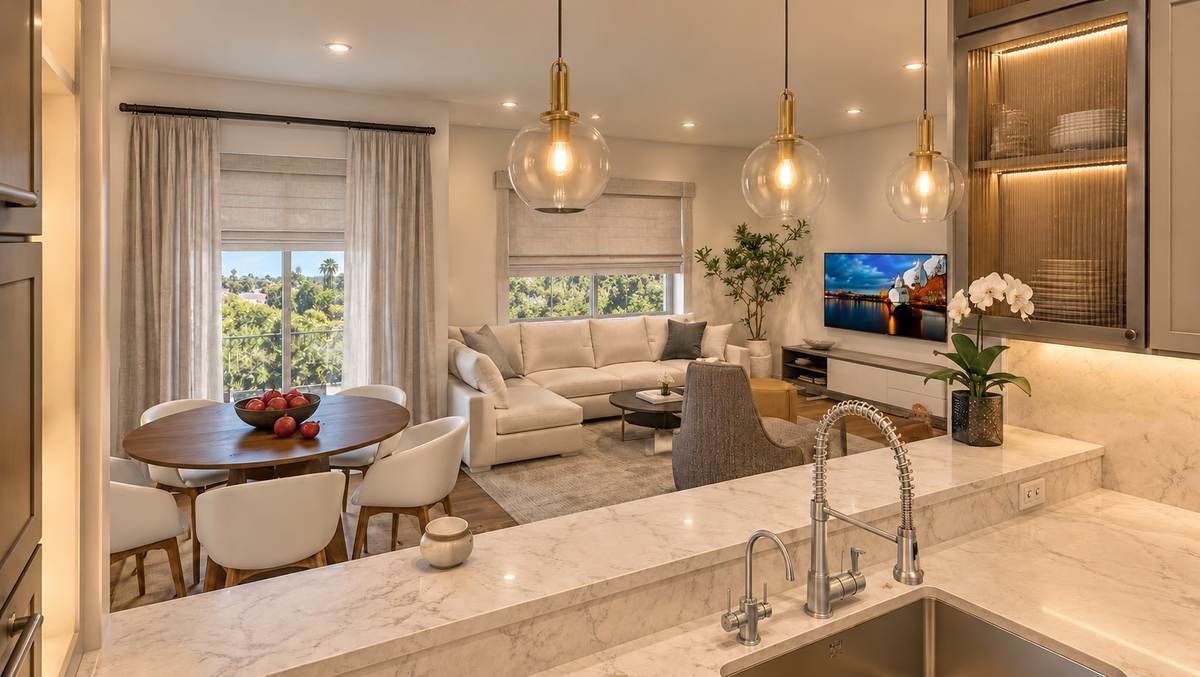
Living rooms need a backdrop that supports both everyday life and entertaining. Soft khaki, warm greige, and light earthy neutrals are the most versatile choices. In rooms with strong afternoon sun, a slightly deeper warm neutral helps prevent a washed-out look.
How Do You Test Paint Colors in Los Angeles Light?
Los Angeles light is bright and often warm, especially in the afternoon, so colors read differently here than in cloudier regions. A simple three-light check helps before you buy gallons:
- Large samples: Use samples of at least 2 x 2 feet, not small chips.
- Two walls: Test one wall with direct sun and one that stays in shade.
- Three times of day: Check morning, mid-afternoon, and evening with the lights on.
- Neighbors: View the color next to the flooring, stone, cabinetry, and outdoor view.
If a color still works after all four steps, it is probably the right one. If it fails one, try a different undertone.
Which Paint Color Mistakes Should You Avoid?
- Choosing from a small chip: Large samples change how color reads.
- Ignoring undertones: A beige can lean pink, green, or yellow.
- Cool tones in warm-light rooms: They can look flat or gray in afternoon sun.
- Going dark without enough light: Deep colors need layered lighting to feel rich, not heavy.
- Matching a trend instead of the room: A color of the year is a starting point, not a rule.
Frequently Asked Questions About Paint Color Trends
Q.1 Is Universal Khaki too dark for a whole house?
It is a mid-tone, so it can feel heavier than a typical beige. Many designers prefer it in living areas or as an accent, with lighter neutrals elsewhere. Always sample it in your own light.
Q.2 Are gray paint colors completely out?
No, but cool, flat grays are less popular. Warmer greige tones with beige undertones are replacing them.
Q.3 How long do paint color trends last?
Trends shift each year, but warm neutrals and earthy tones tend to stay livable longer than bold accent colors. Choose colors you will enjoy beyond one season.
Q.4 How do I choose between khaki and beige?
Compare them side by side on the same wall, since undertones vary by brand and swatch. Khaki usually reads deeper and more earthy than classic beige.
Q.5 What sheen works best for living room walls?
Matte and eggshell finishes are common choices because they hide imperfections. Ask your painter which sheen suits your wall condition and traffic.
Q.6 Can I paint a small room a dark color?
Yes, if the room has good natural or layered light. Otherwise, use the deep shade on one wall or on built-ins.
Choosing Colors That Work With Your Home
The 2026 paint color trends favor warmth, depth, and a stronger link to nature, and the early 2027 picks keep leaning green. For Los Angeles homes, that suits the indoor-outdoor lifestyle and the strong natural light. To see the full palettes behind these picks, the color trend reports from Benjamin Moore and Sherwin-Williams are a useful starting point.
Karamia Designs provides residential interior design in Los Angeles, helping homeowners create cohesive interiors through thoughtful layouts, finishes, and color. If you are planning a repaint or renovation, you can schedule a free design consult to discuss how color can work with your home’s light and layout. Paint colors can look different from screens and printed swatches, so always confirm with samples in your own space.